


Free OpenType Fonts
Updated
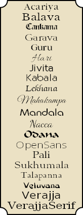
Fonts: A B C Ga Gu H J K L M N Od Op P S T Vel Ver
Latest Updates • OpenType Features • FAQ
Please do not host my fonts or distribute them.
Link to this page for new fonts and the latest updates.
 My Unicode fonts were edited with High-Logic FontCreator, a powerful TrueType font editor. The professional edition automates much of the process of adding composite characters to fonts.The latest version supports class-based kerning and GPOS scripts. The online manual gives details of what it can do, or read my review of the latest changes.
To convert CSK or Skt encoded documents to Unicode use my Find and Replace Macros for OpenOffice/LibreOffice.
 Font collectors may find MainType useful. It is a powerful Font Manager from High-Logic for viewing, installing, organising, and managing fonts. Version 8.0 added listing and comparison of OpenType features and Panose information.
This Serif font catalogue produced with MainType includes my own free fonts, Linux fonts, Fell types, and some from Font Squirrel and SIL. Most others are fonts distributed with Serif products: CraftArtist, DrawPlus, PagePlus, and WebPlus.
 Windows Keyboards for Typing Pāli If you regularly need to type accented characters for European languages, or for romanised Pāli and Sanskrit, install my customised keyboard for windows to type a wide range of accented characters with ease.
äèíõû ñç ÄÈÍÕÛ Ñ Ç and common symbols like †©®™
Click on the Typeface Images to Download 7-Zip Archives
 Acariya is a Garamond style typeface derived from Guru. • Typeface Sample
23/08/2021 (ver 1.90) • 4 type styles, 2,955 Glyphs, > 106K Kerning Pairs
 Balava is a revival of Baskerville derived from Libre Baskerville a font released under the SIL license. • Typeface Sample
23/10/2017 (ver 1.81) • 4 styles, 2,663 Glyphs, > 197K Kerning Pairs
 Cankama is a Gothic, Black Letter script • Typeface Sample
29/1/2018 (ver 2.60) • Regular, 2,413 Glyphs, 2,767 Kerning Pairs
 Garava was designed for body text. It has a generous x-height and economical copy-fit. The family includes Extra-Bold and Extra-Bold Italic styles besides the usual four. Typeface Sample
4/8/2020 (ver 4.041) • 6 styles, 3,331 Glyphs, > 151K Kerning Pairs
 Guru is a condensed Garamond style typeface designed for economy of copyfit. A hundred A4 pages of text set in Pali would be about 98 pages if set in Acariya, 95 if set in Garava or Times New Roman, but only 90 if set in Guru. • Typeface Sample
28/1/2018 (ver 4.00) • 4 type styles, 2,905 Glyphs, > 106K Kerning Pairs
 Hari is a hand-writing script derived from Allura by Robert E. Leuschke, released under the SIL license. Typeface Sample
22/12/2016 (ver 1.10) • Regular type style, 627 glyphs, > 4K Kerning Pairs
 Jivita is an original Sans Serif typeface for body text • Typeface Sample
7/2/2017 (ver 2.30) • 4 type styles, 2,453 Glyphs, > 18K Kerning Pairs
 Kabala is a distinctive Sans Serif typeface designed for display text or headings • Typeface Sample
25/2/2019 (ver 3.50) • 8 type styles, 2,456 Glyphs, > 40K Kerning Pairs
 Lekhana is my version of Zapf Chancery. A flowing script that can be used for correspondence or body text • Typeface Sample
7/2/2017 (ver 2.10) • 4 type styles, 2,331 Glyphs, > 16K Kerning Pairs
 Mahakampa is a hand-writing script derived from Great Vibes by Robert E. Leuschke, released under the SIL license. Typeface Sample
19/5/2016 (ver 1.3) • Regular type style, 626 glyphs, 855 Kerning Pairs
 Mandala is designed for decorative body text or headings. “Mandala” is a Pali word meaning “circle.” • Typeface Sample
6/7/2019 (ver 2.31) • 4 type styles, 2,588 Glyphs, > 88K Kerning Pairs
 Nacca is a hand-writing script derived from Dancing Script by Pablo Impallari and released on Font Squirrel under the SIL license. Typeface Sample.
25/12/2016 (ver 1.20) • Regular type style, 624 Glyphs, > 12K Kerning Pairs
 Odana is a calligraphic brush font suitable for titles, or short texts where a less formal appearance is wanted. • Typeface Sample
6/6/2019 (ver 3.62) • Regular type style, 2,640 Glyphs, > 40K Kerning Pairs
 Open Sans is a Sans Serif font suitable for body text. • Typeface Sample
9/2/2016 (ver 1.71) • Ten type styles, 1766 Glyphs, > 7K Kerning Pairs
 Pali is my version of Hermann Zapf’s Palatino. • Typeface Sample
21/9/2021 (ver 3.76) • 4 type styles, 2,824 Glyphs, > 313-349K Kerning Pairs
 Sukhumala is derived from Sort Mills Goudy. • Typeface Sample
4/8/2020 (ver 2.542) • 5 type styles, 2,779 Glyphs, 290-324K Kerning Pairs
 Talapanna is my version of Goudy Bertham, with decorative gothic capitals and extra ligatures in the Private Use Area. Typeface Sample
3/1/2017 (ver 3.61) • regular/bold styles, 2448 Glyphs, > 24K Kerning Pairs
 Veluvana means “Bamboo Grove.” The Greek glyphs are from Guru. Small Caps are greater than x-height. • Typeface Sample
4/1/2017 (ver 3.20) • Regular type style, 2,577 Glyphs, > 20K Kerning Pairs
 Verajja is a Pali word meaning “a variety of kingdoms or provinces.” It is derived from Bitstream Vera, a font released under an Open license agreement. See the Gnome Project for details. Typeface Sample.
4/8/2020 (ver 4.041) • 4 type styles 2,817 Glyphs, > 72K Kerning pairs
 Verajja Serif now includes OpenType Features • Typeface Sample
28/4/2021 (ver 2.01) • 4 type styles 2,682 Glyphs, > 40K Kerning Pairs
 Font archives compressed using 7-Zip’s LZMA format are typically about half the size of archives produced using standard ZIP format.
To save bandwidth, time, and server space, most downloads now use this format. 7-Zip is highly recommended. It has strong encryption and is a mature OpenSource program.
Mac OS users can download a utility for extracting 7-Zip archives.
I have no way of testing my fonts on Mac OS or other Operating Systems, but I will be interested to know if they work, or if there is a simple modification I can make so that they will work.
6 September, 2025
 Acariya is derived from Guru. It is about 10% less condensed, but contains the same glyphs and OpenType features. Version 1.80 added the Bitcoin currency symbol for Unicode 10, and Transport and Map symbols for Stupa and Pagoda. Kerning pairs were further improved in version 1.81. Ligatures were improved in version 1.90.
Balava version 1.81 fixed some bugs in kerning pairs with ligatures fi, fl, etc., improved the spacing for Qu discretionary ligature, and added glyphs for Bitcoin, and Stupa and Pagoda Transport and Map Symbols.
Cankama Version 2.60 added a Bitcoin currency symbol, Pagoda and Stupa Transport and Map Symbols and super/subscript glyphs for formulae in fractions.
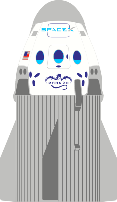
Garava Version 4.01 added some Miscellaneous Symbols and Arrows, Miscellaneous Pictographs and Transport Symbols (with some colour glyphs), improved Latin Extended-D glyphs for AY and VY, added medium mathematical space (455 funits 2/9ths em), added more Alternative Fractions, used anchor-based positioning, for accented Latin composites, added narrow combining accents for narrow glyphs, added Bitcoin currency symbol to complete the character set, composed more composites from composite data, added Roman Numerals to Historical Ligatures (hlig), removed mappings where not needed, but added them where needed for kerning in legacy Serif applications. Garava includes Coloured Stylistic Alternate glyphs and (experimental) swash glyphs. The WOFF versions are unhinted, but the *.otf versions are hinted. Some bugs were fixed and several glyph contours were improved. Version 4.02 improved the alignment and spacing of superscripts, and version 4.03 added a few kerning pairs. Version 4.04 improved the coloured rocket glyph to celebrate the safe return of the Dragon SpaceX Capsule. Version 4.041 fixed a bug.
Guru Version 4.00 added superscript/subscripts glyphs for formulae in fractions and improved kerning.
Hari is a hand-writing script derived from Allura by Robert E. Leuschke, released under the SIL license. Version 1.10 added Ordinals, Historical Ligatures, Localized Forms for Romanian, fij and ij acute ligatures for Dutch, and improved kerning. The original kerning in Allura was not great, and I made it worse in the first release of Hari. I hope it is now usable, but it’s always hard to kern script typefaces. I also added a pair of Geometric Shapes for Full Moon (white circle) and New Moon (Black Circle).
 IVITA Version 2.10 fixed a bug with kerning classes, optimised some complex glyphs, and added a set of smaller Web versions without most of the symbols, Drop Caps, or hinting. Version 2.20 added proportional figures, fixed some bugs in glyph naming, improved kerning classes, and added more kerning pairs. Version 2.30 improved the glyphs with ogonek.
Kabala Version 3.50 removed code-points from Private Use Area glyphs, except Apple Logo, added Bitcoin Currency Symbol, added globe with meridian and clock face glyphs, added colour glyphs for pagoda, directhit, and globe continents, removed Greek and Romanian scripts, replaced Contextual Ligatures with Stylistic Set ss01, replaced Localised Forms (not supported by PagePlus) for Romanian with Stylistic Set ss02, replaced Stylistic Alternates with Character Variants (Ornaments), moved ijacute from liga to dlig, improved positioning of super/subscripts for fractions, tweaked kerning, used smaller diacritics for pcaps.
Lekhana Version 2.00 added a Randomize (rand) feature to randomly swap Capital letters with Swash glyphs. This is just an experiment for the time being. Localized Forms feature was added for Romanian, and ligatures for Dutch. Stylistic Alternates for ! and ~ were added, and the kerning classes were improved. Version 2.10 improved some ogonek contours, added four glyphs with ogonek for Nordic, and added some more kerning pairs. The Stylistic Alternates feature for Initial Capitals was fixed.
Mahakampa is a hand-writing script derived from Great Vibes by Robert E. Leuschke. Version 1.3 added some more discretionary ligatures and a Rupee Sign (Rs), and fixed some bugs.
Mandala Version 2.31 uses Typometrics for line-spacing, added more kerning pairs, and fixed some bugs.
Nacca is a hand-writing script derived from Dancing Script by Pablo Impallari and released on Font Squirrel under the SIL license. Version 1.20 added a bold style, a .notdef glyph, geometric shapes ○ ● for Full Moon and New Moon, currency symbols ₨ and ₫, a few Letterlike symbols, Localized Forms (locl) for Romanian, fij and ij acute ligatures for Dutch, Ordinals, Terminal Forms (fina) for most lowercase a-z glyphs, improved kerning classes and added many more kerning pairs.
 DANA Version 3.62 uses Typometrics for line-spacing. It uses 8192 units/em instead of the usual 2048 units/em to support finer detail for the coloured decorative capitals. The rarely used latin extended superscripts were removed, leaving only those few required for Ordinals. A positionindicator glyph was added to Miscellaneous Technical, and globewithmeridians and electriclightbulb glyphs were added to Miscellaneous Symbols and Pictographs. The clock symbols were improved. An Access All Alternates feature was added. The WOFF versions are unhinted to reduce file sizes. If you want to add hinting to the WOFF versions, this can be done using the free ttfautohint utility, which is what FontCreator uses to hint fonts.
Open Sans is an OpenType font released under an Apache 2.0 License agreement. It has five weights in ten subfamilies, extensive glyph coverage (Latin Extended, Greek, and Cyrillic). It includes OpenType features for Lining, OldStyle, Proportional, and Tabular Figures; Standard Ligatures, Stylistic Alternates, Stylistic Sets, and Localised Forms for Moldavian and Romanian.
 Pali version 3.70 updated the coloured glyph for Transport and Map symbol rocket to celebrate the safe landing of the SpaceX Dragon capsule, added kerning pairs for lowercase, added PUA mappings to super/subscript and petite/small capitals to support kerning in PagePlus, unified advance width of symbols, added uppercase subscripts for fractions, resized superscripts to x-height (used by pcap glyphs), used Autometrics to improve spacing of superscripts, scaled Petite Capitals to match the copyfit of lowercase. Version 3.71 improved the kerning pairs. Version 3.72 improved the Greek glyphs, and added kerning pairs. Version 3.73 added more kerning pairs for Petite/Small Capitals. Version 3.74 loosened some kerning pairs like ‘a, ‘d, ‘e. Version 3.76 loosened some kerning pairs for Tv, Tw, Ty, Cv, Cw, Cy, etc. The WOFF versions are compressed and have no hinting, to minimize file size. If you want to add hinting to the WOFF versions, this can be done easily using the free ttfautohint utility, which is what FontCreator uses to hint fonts.
Sukhumala is based on the Google font Sorts Mill Goudy revival by Barry Schwartz. Version 2.40 added arrows, pictographs, and symbols with the same colour glyphs as Pali. Narrow diacritics were added for narrow glyphs and low profile diacritics were added for capitals, small, and petite capitals. Anchor-based composition was used wherever possible. Roman Numerals were added to historical ligatures. Some contours were redesigned or smoothed. Spacing of super/subscripts was improved with optical metrics. The glyphs in alternative fractions were realigned. Many more kerning pairs were added. Versions 2.43 fixed some kerning pairs. Stylistic Alternates were added to version 2.50; version 2.51 fixed some bugs. Version 2.52 fixed some mapping issues and aligning of italic alternative fractions. Version 2.53 unified font metrics, improved PANOSE classification, and added some kerning pairs. Version 2.54 fixed some bugs. Version 2.542 improved the rocket glyph to celebrate the safe return of the Dragon SpaceX Capsule.
 ALAPANNA Version 3.50 added Localized Forms for Romanian, ligatures for Dutch, smaller and more consistently designed accents for Petite Capitals, added lining figures, improved the kerning classes and added more kerning pairs.
In version 3.60 the Stylistic Alternates were reduced to two colours to make the font easier to maintain. The Bold Stylistic Alternates are now also two-coloured. Firefox and Vivaldi (Chromium-based) support coloured fonts, but most applications do not. Version 3.61 fixed some glyph naming bugs.
Veluvana Version 3.20 fixed many issues with glyph outlines, added Localized Forms for Romanian, fij and ijacute ligature for Dutch, more Stylistic Alternates, improved the kerning classes and added many more kerning pairs.
Verajja version 4.10 added Bitcoin Sign Currency Symbol, Stylistic Alternatives for Drop Capitals, x and ÷ glyphs for sinf. It uses Anchor-based positioning for composites. Roman Numerals were added to Historical Ligatures. Alternative Fractions were restored to the Web versions. Fifteen Miscellaneous Symbols and Arrows were added, and PUA code-points were restored to pcap/smcp/sups to support kerning in Serif Apps. Currency symbols were removed from smcp/pcap, and ([{}]) are used only in c2pc/c2sc. Version 4.11 added lc to Caps kerning pairs, uppercase numerators and denominators, and added # to Character Variants. Version 4.12 coloured rocket glyph to celebrate the safe return of the Dragon SpaceX Capsule. Version 4.13 fixed a bug. The archive contains WOFF/WOFF2 and Web (*.otf) versions with fewer glyphs for embedding on Web Sites. The glyphs are hinted because this is the font that I use on my Websites.
Verajja Serif Version 2.00 adds Stylistic Alternates for gold drop capitals — the Pagoda Symbol is now gold too. The Stylistic Set for symbols was changed to Character Variants, and a second Stylistic set was added for Romanian Alternate forms: Şş and Ţţ. More superscript and subscript glyphs were added for the fractions feature, which now works for fractions like x+y/(a-b). The fonts were validated to remove suspicious points and other bugs.
Icons were added to indicate which OpenType Features are present. Carita and Hattha were withdrawn as they will no longer be updated to match my other fonts.
My most recent fonts no longer use the OpenType Compiler. This only runs under Windows XP so I no longer include scripts to edit OpenType features. Users of FontCreator Pro can edit the OpenType feature scripts directly within the program using its own Visual OpenType Designer of the code editor.
Alternate Annotation Forms: (nalt) These use digits and uppercase (and/or lowercase) letters enclosed in a large circle.
Alternative Fractions: (afrc) Stacking fractions are useful for typesetting fractional measurements in inches. The full set from 1/2 to 63/64 is included, with some kerning pairs where needed.
Case-sensitive Forms: (case) Brackets may be moved up to align better with Capital letters. Or, German Double s may use alternative forms for Capitals or Petite Capitals.
Character Variants: (cv01-cv99) Some glyphs like Gabriola (Windows 7) have alternate letter forms that the user can select manually. My fonts have Character Variants (or Stylistic Alternates) for * + @ © × † ‡ •, Geometric Shapes circle and black circle, and the Miscellaneous Symbol, Black sun with rays.
Contextual Alternates: (calt) Use in connecting script fonts to substitute alternate glyphs after capital glyphs to improve the joining of adjacent glyphs.
Denominators: (dnom): Baseline subscripts for use with the fractions feature. Use the same glyphs as the superscripts
Discretionary Ligatures: (dlig) These are primarily intended for decorative use or to recreate the appearance of historical documents.
Fractions: (frac) Slashed fractions, precomposed from 1/2 to 7/8, or composed from numerators and denominators for other non-Unicode fractions like 1/10th, improper fractions like 4/3, or maths formulae like 1/x or a/b.
Historical Forms: (hist) s will be replaced with long s: It should have a lower precedence than historical ligatures.
Historical Ligatures: (hlig) sb, sh, sk, sl, si ssi, ssl, etc., will be replaced with long s ligatures. The letter pairs with long s tend to clash when followed by letters with ascenders ſb ſh ſl and ſk. My latest fonts use this feature to substitute Roman Numerals.
Kerning: (kern) All of my fonts now have OpenType kerning tables as well as legacy kerning tables. This makes it possible to include many more kerning pairs.
Localised Forms: (locl) My fonts use a Stylistic Set for Localised Forms of Romanian, which substitute S and T cedilla with S and T comma accent, because PagePlus does not support Localised Forms.
OldStyle Figures: (onum) Designed for use with lowercase and petite capitals. If a font’s default figures are OldStyle figures, like Georgia or Talapanna, the font may need lining or tabular figures.
Lining Figures: (lnum) If a font’s default digits are OldStyle figures the lining figures can be used with All Capitals.
Ordinals: (ordn) Where a letter or letters follow a number, this feature will substitute superscripts. In Adobe and Microsoft fonts, this feature is useless as all lowercase letters become superscripts. According to Microsoft’s own recommendations, this feature should be contextual.
Ornaments: (ornm) A convenient way to access dingbats or enclosed alphanumerics. Type 0-9, a-z, or A-Z, to access a wide range of symbols. My fonts use this feature to substitute wk, bq, wr, bb, wn, bp with Chess Pieces white king ♔, black queen♛, white rook ♖, black bishop♝, white knight♘, black pawn ♟, etc.
Numerators: (numr): Superscripts for use with the fractions feature. Also includes A-Z, a-z for use with ordinals (and a wide range of accented superscripts in some fonts).
Petite Capitals: (pcap) smaller capital letters designed to match the x-height of the font, and similar in stroke weight and advance width to the lowercase glyphs. If well designed, enabling or disabling this feature for lowercase text should make only a little difference to spacing or line-breaks.
Petite Capitals From Capitals: (c2pc) Uppercase letters will also be replaced with Petite Capitals if this feature is used. Serif™ call this “Capitals to Petite Capitals.” This feature applies smaller punctuation to match the height of petite capitals, which is the font’s x-height.
Proportional Figures: (pnum) Proportional figures for fonts with monospaced default figures. They may be lining figures (aligning with capitals) or OldStyle (aligning with x-height).
Scientific Inferiors: (sinf) Subscripts that bisect the baseline for use with Chemical formulae like H2O (Water), C2H4 (Ethylene), H2SO4 (sulphuric acid), etc.
Slashed Zero: (zero) Figure zero with slash to make it easier to distinguish from the Capital O.
Small Capitals: (smcp) these are usually about 70% to 80% of the Caps Height and similar in proportion to the majuscule forms.
Small Capitals From Capitals: (c2sc) Uppercase letters will also be replaced with Small Capitals if this feature is used. Serif™ call this Capitals to Small Capitals.
Standard Ligatures: (liga) These should be enabled by default. The Alphabetic Presentation Forms of ff, fi, fl, ffi, ffl are supplemented by other pairs like ffr, ky or tt, where adjacent letters clash.
Stylistic Alternates: (salt) Cankama, Garava, Jivita, Lekhana, Mandala, Odana, Pali, Sukhumala, Talapanna, and Verajja have Decorative Drop Capitals that use this feature. My fonts use a contextual substitution, so only the first capital letter of a word is substituted.
Stylistic Sets: (ss01) Sets of glyphs that are designed to harmonise.
Subscript: (subs) Subscript digits or A-z aligned on the baseline for use with the fractions feature.
Superscript: (sups) Superscript digits and letters. The same glyphs are used by the ordinals and fractions feature, and by subscripts. They may be used for maths formulae such as a²+b² = c².
Swash: (swsh) Replaces glyphs with alternative swash forms. May be Upper, and/or lowercase with more than one set of alternate glyphs. If the feature is enabled, all supported glyphs are substituted with swash variant forms. They are coloured if applications support coloured fonts (e.g. Firefox or Vivaldi).
Tabular Figures: (tnum) Fixed width figures for fonts with proportional default figures.
Terminal Forms: (fina) Greek sigma has a terminal form for use at the end of words.
Titling: (titl) Lighter, and more generously spaced, capital letters designed for use at large point sizes — say, 36 point or larger. My fonts now use glyph positioning to increase spacing for capitals. This feature is not supported by PagePlus or other Serif™ applications.
OpenType Glyph Substitutions
 My fonts use the Private Use area for some extra glyphs. If your favourite application does not support OpenType features, the extra glyphs can be inserted by using the Windows Character Map or BabelMap but be aware that if you change the font later, the Private Use area glyphs may not exist in other fonts, or the code-points may be used by different glyphs.
Stacking fractions save space when typesetting measurements. Enable kerning for the best results. Regular fractions support any numbers and a-z (also A-Z in my later fonts), while stacking fractions include a full set up to 63/64. Enable the OpenType Alternative Fractions feature, and type, 1/3 or 31/64. Insert a zero-width space after whole numbers to prevent them being included in the numerator. Enable kerning for the best results.
- Are these fonts copyright? Yes. Although they are free, they are subject to copyright under the GNU License. You may modify the fonts, include glyphs in your own fonts, and even sell your modified versions, but if you do they must also be released under the same GNU License terms. Modified versions must be renamed.
- Can I host your fonts on my web site? No. Please do not redistribute my fonts, but post a link to this page to ensure that everyone can get the latest versions and other new fonts. I regularly update and improve my fonts, and I wish to ensure that users always have the latest versions.
- How can I use the OpenType features? If you have a program with OpenType support you can access the OpenType features. PagePlus supports all of the OpenType features in my fonts and was used to test them. Development of PagePlus has ceased; it has been replaced by Affinity Publisher, but is still worth buying if you can find a licensed copy. Affinity Publisher lacks some basic features.
- Can I use OpenType features in LibreOffice? Yes. Version 5.3.0 now supports OpenType features. There is currently not any convenient interface for selecting them, but read my brief explanation to learn how to use them.
- How Did You Add the OpenType Features? I use FontCreator. See this Tutorial.
- How Do I install OpenType Fonts? The same way as you install TrueType fonts. Open the Windows Fonts folder and select “Install New Font...” from the file menu. Browse to where the fonts are saved and select them. You can also use a Font Manager such as MainType.
- How do I open the 7-Zip Archives? Download the 7-Zip archive program from Source Forge. IZArc will also open 7-Zip archives.
- Why do you use 7-Zip Format? Because TrueType fonts compress much better with the LZMA format used by 7-Zip than with standard Zip format. Archives are typically only half the size, which means less server space, less bandwidth, and faster downloads. A large font set like Kabala (8 type styles) is 4.47 Mbytes compressed to Zip format, 2.28 Mbytes compressed to 7-Zip format. 7-Zip is free, Open Source, and small (1.37 Mbytes).
- How long does it take to make a font? That depends on how well you want to do it. Anything between a few minutes or several years. Please see the story of The Chariot Maker for some inspiration. Font Editing can be a long and frustrating process and the polishing is never finished.
- What if I find a bug in your fonts? I am always glad to hear about bugs or defects in my fonts. If I know about them I can usually fix them easily; often the same day. Send me an E-mail with a screen-shot and an explanation of what you think is wrong, or with suggestions for improvements.
- Version Numbers: In general, a minor version number indicates a bug-fix release, so 3.721 would be a bug-fix release for version 3.720, but 3.730 would have new glyphs, new kerning pairs, or new OpenType features. Version 4.00 would be a minor upgrade of version 3.90.

PagePlus Keyboard (for Windows)
 PagePlus has a customisable keyboard, but lacks the option to assign individual characters to shortcuts, unless they already appear on the menus. This keyboard was designed for typing the accented characters required for Pāli using the Microsoft Keyboard Layout Creator. Unlike the Windows UK International Keyboard, it can type a full range of accented characters for East European languages — ç, ł, ņ, ż, etc., as well as those needed for French or German. Full list of shortcuts.
Installing the Keyboards
 To install a keyboard — extract the files in the archive to any convenient location, then double-click on the installation program to install the keyboard. The PagePlus keyboard package includes the source file so you can modify it as you wish using the Microsoft Keyboard Layout Creator.
After installation, you can select the keyboard in Control Panel, Languages and Keyboard Options, Add other languages, Details, where you can select the keyboard from the drop down list. That makes the keyboard available — to activate it, click on the icon in the system tray and select it from the list.
To uninstall the keyboard use Add or Remove programs from Windows Control Panel or run the installation setup program again.
If you need to type in European languages as well as Pāli, I recommend the PagePlus keyboard. It has the widest range of shortcuts and is easier to use for typing English. If you don’t need most of the shortcuts they won’t slow you down, just learn the ones that you do need. Any keyboard shortcuts that you assign in PagePlus or other programs will override my assignments.
If you have any feedback on the keyboards or fonts, send me an email.
If you don’t tell me about bugs or defects they cannot be fixed.
Page last updated on 06 September 2025